Internet and office use.
In my opinion the microscopic dot pitch on the huge 30” screen is unacceptable for text rendering. So with no doubt I set dpi to 150% that made the screen looks just fantastic!
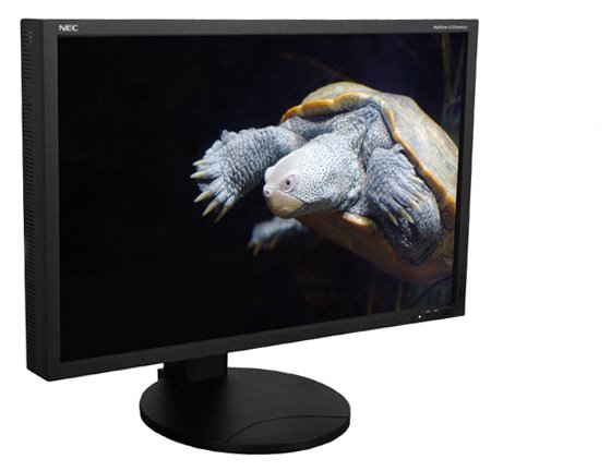
30" with 2560x1600 is a real asset for the office work.
Originally I planned to use lower resolution (1920x1200) to make fonts readable but… no, it’s not as good as higher dpi at native resolution. The crystalline effect melts when fonts are made larger. The next photo shows font #10 at standard 96dpi in comparison with 150% increase. You can see that the text is not only larger, it’s now perfectly written using more material (dots) for more accurate shape. The new H-IPS pixel layout makes texts more clear. Pixels are lit completely (evenly) that makes letters more clear (on PVA panels pixel may lit partially that makes text slightly fuzzy).